 30 day returns
 2000+ reviews
Choosing The Perfect Colour Palette For Your Kitchen
Welcome to the Lakeland Furniture blog, where you’ll find handy guides and advice on seating styles, trends, fabrics, and design. Looking for inspiration or information on bar stools, dining chairs, and office chairs? You’re in the right place.
Ready to find your perfect seating? Explore our Buying Guide.

In our previous article, we focused on new home furniture, and a buying checklist to ensure you don’t forget the essentials – we wouldn’t want you all moved into a new house to only forget that in fact, you did forget to buy a dining table to serve your dinner on, or a coffee table to put your feet up on after you’ve finally finished stripping wallpaper that seemed like it was genuinely glued to the wall. The next step to take when you move into a new house is to make it your home and if you don’t know anything about interior design, colour palettes or colour wheels, we’re here to help. Colour psychology has a great impact on the home and can alter our moods significantly. There is great importance in choosing the right colour scheme, and it all comes down to what atmosphere you want to achieve and the purpose of the room.
Kitchen Colour Schemes
There are many variations of colour schemes that you could go for. Pinterest is great for gaining some inspiration and new ideas that you wouldn’t think of. You can go for existing colour schemes that are widely popular for homes similar to yours, or you can create your own! This provides a whole new level of creative freedom and a lot of fun. Before you go through hundreds of colour swatches, there are a few things you should consider first.
1) Understand your fixed elements – This means you need to review what colours you currently have to work with, the colours that you can’t really get rid of. There are some automatic elements in the home that you can’t erase, but that just adds to the challenge of creating a colour palette you’re proud of.
2) Know the purpose of each room – You need to know what environment you want to create before you start decorating. Let’s take the bathroom for example, do you want this is to be your ultimate place of relaxation? Great, light and neutral colours only permitted in this area!
3) Determine your neutrals – Neutral colours are what make the colour wheel go round. They’re an important part of any colour scheme, so we recommend choosing a white and one neutral colour. Learn more about colour psychology in interior design to get a better insight as to what colours represent.
Create Your Own Colour Palette For The Home
Here is our step by step guide to creating your own colour palette for the home to help you achieve a unique and distinct look that will stand the test of time, and ever-growing trends.
Choose a White White is a very powerful colour, it’s widely used in and around the home as it creates a brighter, more spacious look and feel. It’s simplicity is what makes it so popular, and anything goes with white! Choosing a white colour is ultimately the default colour. And don’t be fooled, there are whites that are different! Although you might not be able to tell the difference in a store when you’re judging which white is best, the moment you test them on the wall, you can see the difference in undertones.
Tip: Using a warm white offers a welcoming feel. Many of us accessorise white by using it on ceilings, doors, trims and more.
Choose a Neutral Colour Neutrals are split into 2 – warm neutrals and cool neutrals. The purpose of a warm neutral colour is to co-ordinate with warm undertones such as yellow, orange and red. It should also compliment cool undertone colours such as green or blue. We then also have beige colours which are often referred to as ‘option c’. These colours go well with warm or cool colours, so if you can’t find a middle ground or a great balance when producing your personal colour scheme, this might be your saviour.
Warm neutrals – red, orange, yellow
Cool neutrals – green, blue, purple
Choose a Bold Colour Bold colours are colours that are quite strong, rich and vibrant. It is essentially the main colour in your palette, as well as the boldest. Choosing a bold colour is important, as you don’t want to tire of it. A version of your favourite colour is a promising choice, as you’ll know you won’t get bored of it! Bold cold colours work best when they have something to play off of too.
Bold colour examples – blue, green, red, yellow, purple.
Choose a Colour That Matches Your Bold Colour Your bold colour needs a friend, so it’s time to pick another that will flawlessly match. Many trending interior design styles feature the bold colour, then the same bold colour but in a different, lighter shade. It works well together and looks great, and if you’re one to not make bold decisions (no pun intended), this is a safe choice.
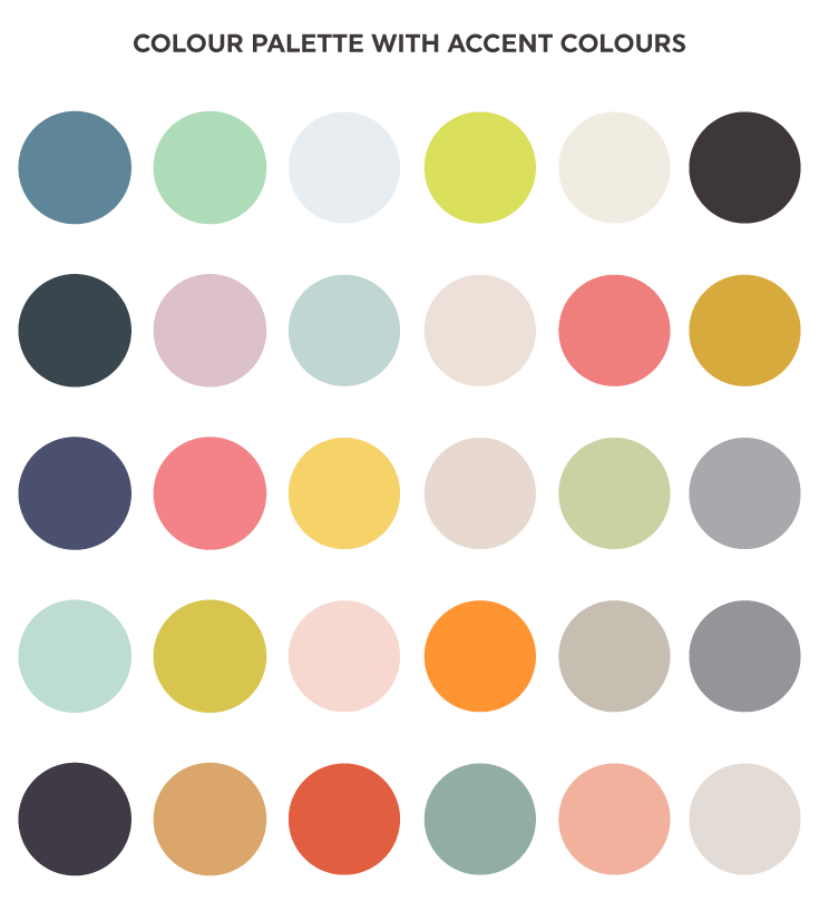
Choose an Accent Colour Accent colours are used to provide more emphasis on a colour scheme. They are used in smaller quantities, as it’s not designed to overpower an existing colour palette. They essentially bring a nice balance and a sense of harmony overall. We recommend picking an accent colour that is the brightest shade in your palette.
Accent colour examples – blue and yellow work extremely well together. Orange and egg blue is a distinct colour scheme. Grey and gold for a luxurious, sophisticated feel.
We hope our home colour palette tips have provided some help for you to start your decorating journey in your new home! For all of your furniture needs, discover our range of bar stools, dining chairs, garden furniture and more to kit out your home in style.
About the Author

Comments