 Chat with us on WhatsApp

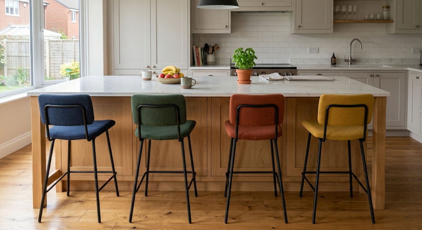
Brighten Your Kitchen With Colourful Bar Stools
Colourful bar stools are one of the simplest ways to change the feel of a kitchen without replacing cabinets, worktops, or flooring. In kitchens built around neutral colours, wood finishes, or darker cabinetry, a brighter stool colour can introduce contrast, define seating zones, and stop the space looking flat or overly uniform.
The key is choosing colour with structure rather than treating it as decoration alone. Stool colour affects how visible marks and wear become, how the seating interacts with lighting, and whether the kitchen feels balanced or visually crowded. Bright stools can work well in modern kitchens, family kitchens, breakfast bars, and open-plan layouts when the colour, frame finish, and upholstery are selected carefully.
This guide focuses specifically on colourful bar stools, how they work in different kitchen styles, and what buyers should consider before choosing stronger colours for everyday use.
Why Colourful Bar Stools Work Well In Neutral Kitchens
Most kitchens are built around safe base colours such as white, grey, black, navy, beige, or natural wood. Colourful bar stools create separation between the seating area and the rest of the room without requiring major changes elsewhere.
In open-plan kitchens especially, brighter seating can stop islands and breakfast bars blending into surrounding cabinetry. This works particularly well with:
- White shaker kitchens
- Grey handleless kitchens
- Matte black kitchens
- Oak and walnut kitchens
- Concrete-effect worktops
- Light stone flooring
Colours like mustard, burnt orange, teal, forest green, navy blue, and rust tend to work more consistently than very bright primary colours because they add contrast without overpowering the room.
Our customers often focus entirely on the seat colour at first, but the frame finish usually changes the final look just as much once the stools are actually placed around the island.
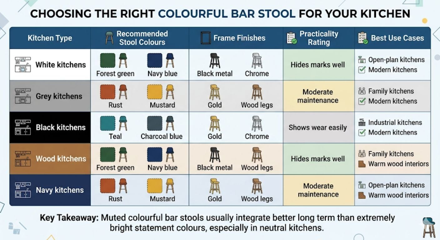
Which Colours Work Best With Different Kitchen Styles?
Blue Bar Stools
Blue works well because it fits both warm and cool kitchen palettes. Navy stools pair naturally with grey kitchens and marble-style worktops, while lighter blues soften darker spaces without creating excessive contrast.
Blue upholstery is also practical for everyday use because marks and fabric shading are usually less visible than on cream or pastel finishes.
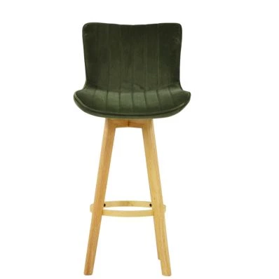
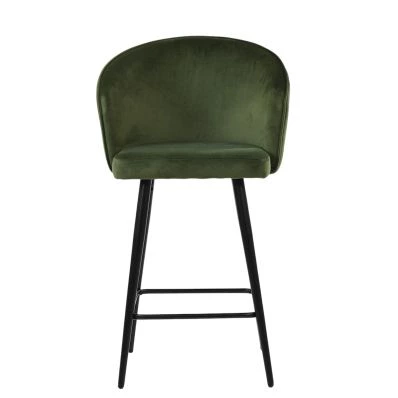
Green Bar Stools
Green bar stools work particularly well with wood kitchens, brass accents, and warmer lighting. Dark green upholstery creates contrast against white cabinetry while still feeling restrained enough for long-term use.
Forest green and olive shades are usually easier to integrate than brighter lime or neon greens.
Orange And Rust Tones
Rust, terracotta, and burnt orange stools suit kitchens with walnut, oak, or black finishes. These warmer colours work especially well in kitchens that already contain wood grain or bronze-toned metals.
Strong orange shades can dominate smaller kitchens, so muted earthy tones tend to age better visually.
Yellow And Mustard
Mustard stools can brighten darker kitchens effectively, particularly where natural light is limited. They pair well with black accents, exposed brick, and industrial-style kitchens.
Bright yellow finishes create stronger visual impact but are harder to balance across the wider room.
Fabric, Finish, And Colour Combination Matters
Colour alone does not determine how bold a stool looks once installed. Upholstery texture and frame finish change the overall effect significantly.
Velvet Upholstery
Velvet reflects light differently throughout the day, which makes colours appear richer and deeper under kitchen lighting. This is one reason velvet stools are often used to introduce colour into otherwise neutral kitchens.
For buyers considering velvet finishes specifically, our guide on velvet bar stool durability and practicality explains how they perform in everyday use.
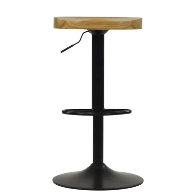
Metal Frame Finishes
Frame colour changes how strong the seat colour appears:
- Black frames create sharper contrast and a more modern appearance
- Chrome frames reflect surrounding light and soften darker colours
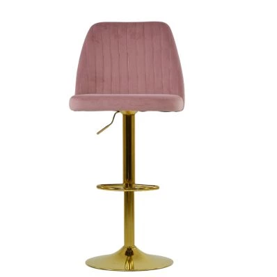
- Gold finishes create warmer contrast with green, navy, or rust upholstery
- Wood legs reduce the visual intensity of brighter fabrics
Buyers often focus only on upholstery colour online, but the frame finish becomes much more noticeable once the stools sit against kitchen cabinets and flooring.
How To Prevent Bright Colours From Looking Overwhelming
Bright stools work best when the colour is repeated subtly elsewhere in the room. This does not mean matching every accessory. Instead, kitchens usually look more balanced when the stool colour connects to one or two existing elements such as:
- Pendant lighting
- Artwork
- Small appliances
- Cabinet handles
- Wood finishes
- Splashback tones
Using four different bright colours together can easily make the kitchen feel visually crowded. Most kitchens work better with:
- One dominant stool colour
- Neutral cabinetry
- One supporting accent finish
For broader kitchen layout and styling considerations, the main kitchen island design guide covers how seating fits into larger kitchen planning decisions.
Practical Considerations Buyers Often Miss
Floor Protection
Bright stools are often paired with metal bases, especially in modern kitchens. Protective floor pads matter more than many buyers expect, particularly on hardwood, laminate, or tiled floors.
Look for:
- Rubber rings on trumpet bases
- Protective pads on fixed legs
- Felt protectors for wood flooring
- Anti-slip base protection
Seat Height Still Matters
Even when colour is the main buying focus, stool height still determines whether the seating feels usable day-to-day.
A comfortable setup normally leaves around 25–30cm between the seat and the underside of the worktop.
For detailed sizing guidance, see our separate bar stool height guide.
Maintenance Expectations
Darker colourful fabrics usually hide daily wear better than pale fabrics. Mid-tone greens, blues, and rust colours tend to age more evenly than cream, yellow, or pastel upholstery.
Homes with children or pets generally benefit from:
- Textured fabrics
- PU leather finishes
- Darker upholstery colours
- Powder-coated frames
When Colourful Bar Stools Make Sense — And When They Do Not
Colourful Stools Usually Work Well For:
- Neutral kitchens needing contrast
- Open-plan kitchen spaces
- Kitchen islands that visually blend into cabinetry
- Homes using warm wood finishes
- Modern kitchens with simple cabinet designs
- Buyers wanting the seating area to stand out slightly
They Are Less Suitable For:
- Highly patterned kitchens
- Very compact kitchens with multiple competing colours
- Ultra-minimal monochrome interiors
- Buyers likely to redecorate frequently
- Kitchens already using strong cabinet colours
Strong stool colours are usually easier to introduce into neutral kitchens than into kitchens where cabinetry already dominates visually.
Do Colourful Bar Stools Go Out Of Style?
Muted colours generally remain easier to live with long term than extremely bright statement shades. Forest green, navy, rust, charcoal blue, and mustard tend to stay visually usable longer because they function almost like neutrals once integrated into the wider kitchen palette.
Very bright reds, pinks, and neon shades create stronger impact initially but can become restrictive if the kitchen changes later.
One approach that works well is introducing colour through upholstery while keeping the frame neutral. This keeps the stools easier to integrate if the kitchen changes in future.
-
-
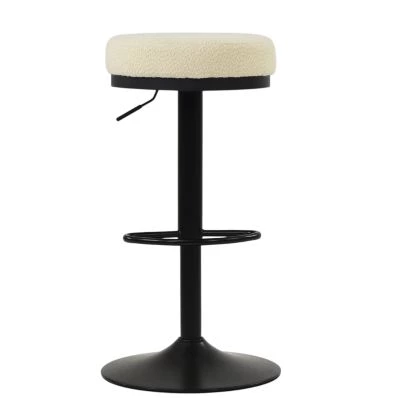
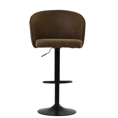
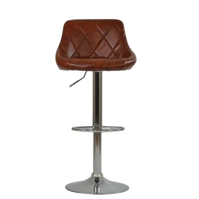
 Matteo 65cm Bar Stool in Aged Brown Leather & Black BaseSpecial Price £59.99 Regular Price £74.99 Original price 20% Inc VATSaving £15
 -
-
-
-
-
-
-
-
-
Conclusion
Colourful bar stools work best when the colour supports the wider kitchen rather than competing with it. Stronger colours can define seating areas, soften neutral kitchens, and introduce contrast without requiring major renovation work.
The most successful combinations usually balance colour with practical considerations such as upholstery durability, frame finish, floor protection, and long-term compatibility with the kitchen layout.
If you are comparing seating styles across different kitchen layouts, our wider bar stool collection and the main kitchen island planning guide cover broader seating and layout decisions in more detail.


Comments